
Intro to Matplotlib
Matplotlib is a popular charting library for the python data science ecosystem. It’s easy to use and quick to setup. If you don’t have matplotlib installed on your machine already, install it with pip install matplotlib.
pip3 install matplotlibLine chart
from matplotlib import pyplot as plt

years = [1950, 1960, 1970, 1980, 1990, 2000, 2010]
prices = [100,200,300,400,500,600,700]

plt.plot(years, prices, color='blue', marker='x', linestyle='solid')
plt.title("random prices")
plt.ylabel("$")
plt.show()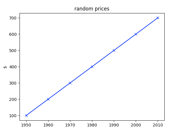
Bar chart
from matplotlib import pyplot as plt

user = ["Ed", "Ben", "Geoff", "Jeff", "Bill"]
number_of_degrees = [1, 2, 3, 4, 5]

plt.bar(range(len(user)), number_of_degrees)
plt.title("# Degrees by User")
plt.ylabel("# of Degrees")
plt.xticks(range(len(user)), user)
plt.show()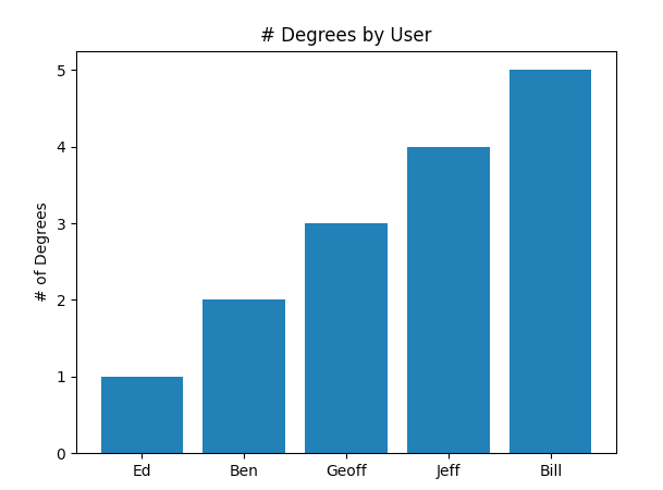
Scatterplot
from matplotlib import pyplot as plt

friends = [ 70, 65, 72, 63, 71, 64, 60, 64, 67]
income = [75, 70, 75, 120, 220, 130, 105, 145, 190]
labels = ['a', 'b', 'c', 'd', 'e', 'f', 'g', 'h', 'i']

plt.scatter(friends, income)

for label, friend_count, income in zip(labels,friends,income):
  plt.annotate(label,
    xy=(friend_count, income), xytext=(5, -5),
    textcoords='offset points')

plt.title("Income vs. Number of Friends")
plt.xlabel("# of friends")
plt.ylabel("$ Income(thousands)")
plt.show()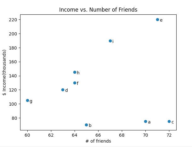
Above I showed some examples of creating line charts, bar charts and scatterplots. You can find more information about matplotlib from their doucumentations https://matplotlib.org/3.2.2/contents.html.
-
-
 Python Scikit Learn Random Forest Classification Tutorial
8 years ago
Python Scikit Learn Random Forest Classification Tutorial
8 years ago
-
 How To Change Navigation Bar Color iOS Swift 5
9 years ago
How To Change Navigation Bar Color iOS Swift 5
9 years ago
-
How To Standardize Data In Python With Scikit Learn
8 years ago
-
How to turn on the flashlight with iOS Swift
9 years ago
-
How To Normalize Data In Python With Scikit Learn
8 years ago
-
Python Perceptron Tutorial
8 years ago
-
 How to jump in a 2d Unity Game
6 years ago
How to jump in a 2d Unity Game
6 years ago
-
How To Display An Alert In iOS & Swift 5
9 years ago
-
Build Your First Neural Network With Python And Keras
8 years ago
-
How to access keyboard inputs/key presses in your Unity game
6 years ago
-